My first professional gig out of art college was with George Patterson Bates, Brisbane. I used to spend many afternoons hanging out in the best book shop in the city, getting all the best tips from Peter B (RIP) who ran the shop. Being the quintessential salesman-who-never-sold, Peter was well connected with his clientele, and passed on my name to the CD at GBP, Ron Weidemann. This was in 2000.
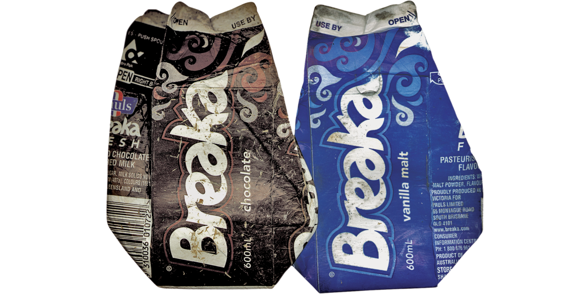
One of my initial projects for Ron was to redesign the Breaka Milk brand. I remember sitting in the presentation meeting to present my work feeling quite out-of-place in my skateboarding sneakers amongst the suits. The graphics were a hit and I was given the green light to redesign the brand and packaging.
I redrew the logotype by hand, adding wave devices. It was also a big deal to place the brandmark vertically down the packaging to maximise the brandmark.
You can still find Breaka in Australian supermarkets today, albeit they've lost a little of the surfer edge I had originally christened it with.
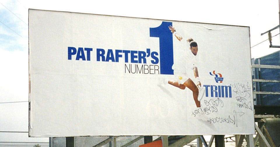
While at GPB, I also did 3 consecutive outdoor campaigns for Pauls Milk featuring Pat Rafter, right at his peak. While I thought it a little too easy to rip off Reid Miles, getting away with this kind of white space in Australian advertising at the turn of the century was an achievement in itself.
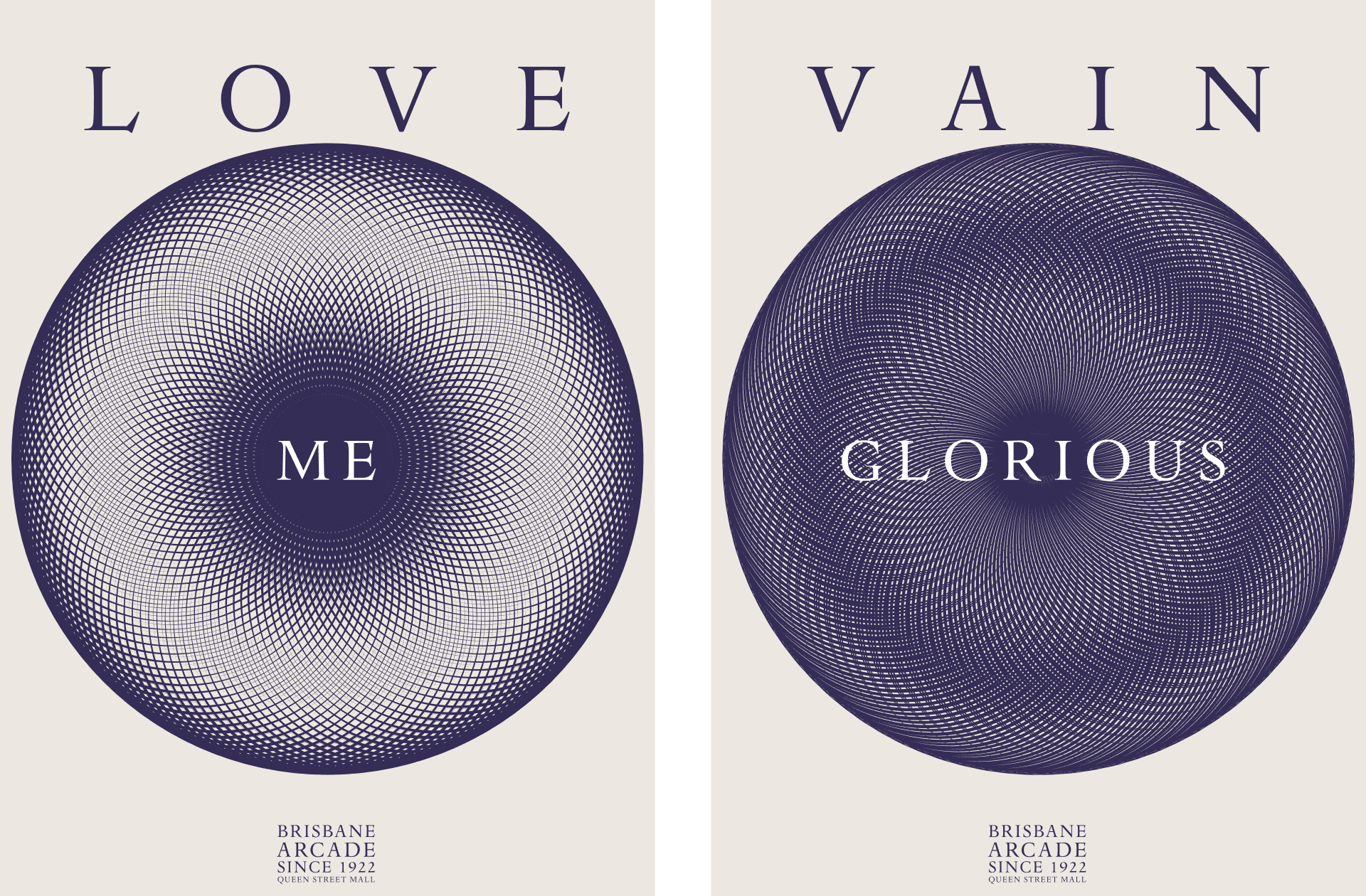
I'm also still fond of this campaign for Brisbane Arcade. Aggressively lean and simple, it was a great example of how to make a little go a long way. The posters used a reflective paper to reflect the white space at night, and came in both white and reversed-out versions, much like dark mode on this website.